Since launching the Pack, a bunch of you have written/tweeted me asking for my take on the "designed vs. plain" debate.
"Designed" vs plain emails?
Here's what I think:
The inbox is where real work happens
Years ago, my friend Patrick McKenzie was giving a talk (I think it was at Microconf) and he quipped, "the inbox is where real work happens. Use that to your advantage."
What he was getting at was the fact that we tend to divide the stuff in our inbox into two camps:
Real emails. Emails from clients, customers, colleagues, your boss, your partner, etc. These are usually plain, with the occasional richtext formatting ("you have to check this article out!") and maybeee a picture or two. We internalise these as peer-to-peer emails. We read them. And if necessary, we reply to them.
Automated emails. Receipts from Amazon, a grid of products you should be interested in from some retailer you bought from once, and so on. These are obviously computer generated emails that aren't as important, and they often have a bit more design and templating in play.
Patrick's argument holds a lot of weight, and it's been reinforced by other friends and colleagues (notably Nathan Barry, founder of ConvertKit, who originally included zero support for designed emails.)
Treat your marketing emails like "real" emails, and they'll get read. And because "real" emails usually are plain, make your emails plain.
And I mostly agree with this. Though not as much as I used to.
Over the years, I've done a fair amount of testing. Like any email marketer, I want my emails to be opened, read to the end, and (when prompted) have my call-to-actions clicked on.
And as I've slowly moved from 100% plain, richtext-only to email templates like the one you're looking at now, I've come to the conclusion that slightly designed emails outperform plain emails.
Below are my reasons for thinking this, along with some metrics for Create & Sell.
But first, let's see what the deliverability experts have to say...
What do deliverability experts have to say?
Plain? Designed? Lots of images? No pics? Are there too many links? Am I using "red flag" words (like FREE, or SALE, or whatever...)?
There's a lot of speculation around how a given email provider decides on whether to put your emails in the inbox or the spam folder.
Here's what Garrett at Postmark (the gold standard of email deliverability) had to say on an article on engagement:
"Ultimately, engagement is entirely in the hands of your recipients. So higher quality and more useful emails are the only way to lift engagement." –Garrett Dimon
Want to get people reading your emails? Send... great emails.
Get people to actually read your stuff, rather than archive your emails. And, ideally, ask for replies (more on this later.) Write your emails to function identically to those 'real' emails I talked about above.
Garrett goes on to say, "...providers pay attention to other engagement factors as well. Are people opening your emails? How long are they reading them? Are they clicking on links? Are they replying to the emails? Are they deleting them without opening them? All of these factor into engagement, and the inbox providers use them to classify your emails somewhere on the spectrum of wanted and unwanted."
Alyssa Dulin, head of deliverability at ConvertKit, dropped quite a few value bombs in an early episode of her podcast on deliverability:
"Be sure to include enough text so that, if images failed to load, your email would still make sense. This helps ensure you have enough text to accompany your images, and also provides a better experience for subscribers. Be sure to never send an image-only email." –Alyssa Dulin
What seems to matter most isn't that your email has images, or that there's a subtle background colour, or that you're adding little highlight-y things to bold text in your headlines, it's all about whether your email makes any sense (even if someone doesn't have image loading enabled.)
You've probably seen highly styled and designed product emails from retailers. Frequently these emails are made up of only images. Those are the autogenerated emails that end up unread and, ultimately, filtered out.
Alyssa goes on to say, "The content of your email will determine the way subscribers engage, or don't engage with your messages. In this way, content has a big impact on your reputation and deliverability. If your content is misleading, doesn't provide value, is irrelevant to subscribers, or is too promotional, it's likely that subscribers will mark the message as spam, unsubscribe, or just not open it."
Once again, it's all about the content of your email. Not how it's structured. Or if you have lots of links. Or pictures. Or whatever else. The content.
My 5 rules for emails that get opened, read, and engaged with.
Want to send success emails? Based on my experience and the the conversations I've had with other email marketers, here's what I think you need to be doing:
RULE #1: Write great emails
This should be obvious by now, but I think the primary thing you should be optimising for is what you're saying in your emails and how that gets people actually getting to the end of your emails AND opening future emails.
I really like the idea of keeping your ear to the ground and listening to what people have to say. To do this, I have systems that ask new subscribers what email marketing struggles they have. This allows what I write to be responses to actual questions – but delivered at scale (i.e. sent to everyone.)
I find a weekly email works well for Create & Sell, but there are some email lists – like Patrick McKenzie's, who I mentioned above – where when an email is sent out, pretty much all subscribers drop what they're doing to read it.
And on the question of frequency, I'm not a huge fan of the daily email trend, only because I think there's only so much you can say about a subject before you start sounding stale. There's a newsletter on value-based pricing that sends a daily email. While I think the ideas are great and respect the hell out of the guy behind it, I think the individual content becomes quickly repetitive. Exceptions obviously include fast-changing subjects, i.e. a daily newsletter on the state of the stock market.
RULE #2: Don't make people think too hard about why they're getting your emails
With Create & Sell, I include a logo at the top of every email.
I do this because I've ended up on a lot of email newsletters, and I often forget who this person is and why I'm getting the email. By putting my brand's logo at the top and linking it to the website, figuring out "who the heck Brennan Dunn is and why I'm getting this" should take just a click.
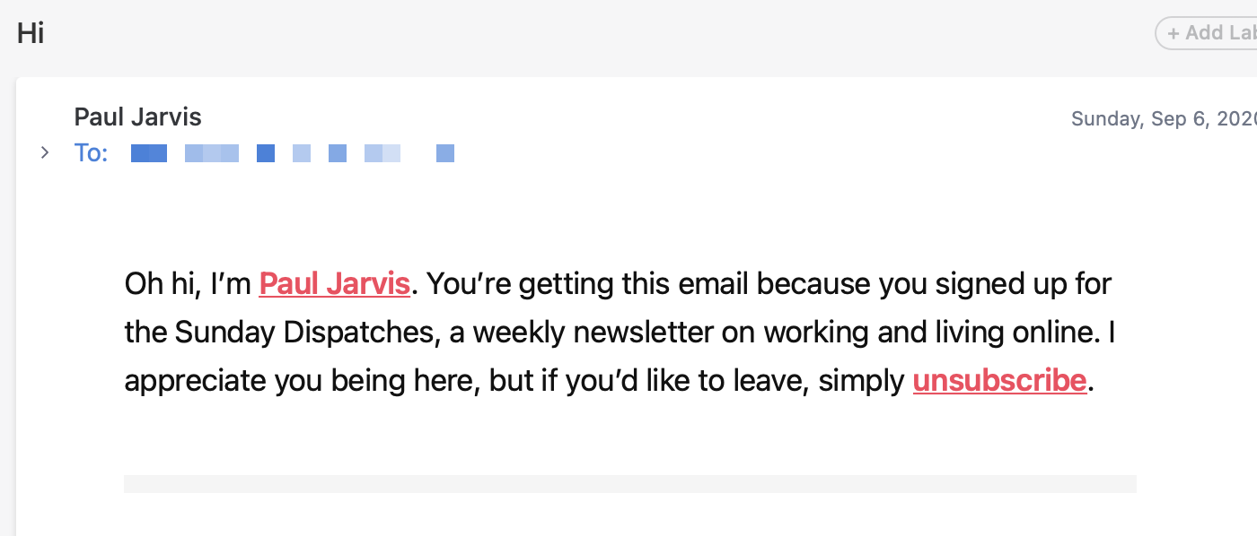
I've always liked how Paul Jarvis did this with his newsletter:
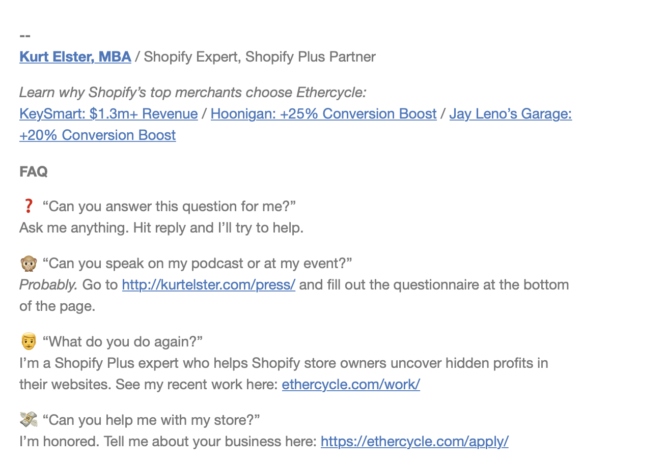
And, while I prefer not having people need to scroll to the bottom of an email to get that context, Kurt Elster does a good job of establishing the "why" in his email footer:
RULE #3: People are visual and like structure
Sales pages might start as a Google Doc, but they're usually turned into a designed web page before they're shared with the world.
This is because there's only so much you can do with the limitations of richtext. Sure, you can add headlines, bolded text, italics, and so on... but creating visual hierarchy, and separating out a case study from, say, the surrounding sales copy becomes a challenge.
"There’s a good usability principle right there: If something requires a large investment of time—or looks like it will—it’s less likely to be used." –Steve Krug
Steve Krug, of Don't Make Me Think fame, has built a reputation on talking about how people don't want to need to think too hard when engaging with a website.
I think the same is true with emails.
A wall of text is hard to parse. Use subheadlines. Highlight things. Add "widgets" to show off testimonials, referral call-to-actions, or just general CTAs.
For example, compare and contrast the following newsletter referral call-to-action from NYT best-selling author James Clear.
Here's what he's doing now (and he's using my Creator Email Template Pack to do it):
And here's what he was doing before:
The designed version is more successful – it gets more people to engage and, ultimately, share – and it does that because it isn't "mixed" into the surrounding email content.
RULE #4: Don't be a jerk
You didn't "just write this email before running off to dinner" and, no, that email that was sent to 10,000 people wasn't "sent from my iphone"
Yes, bulk emails can look the same as the "real" emails I talked about above. But don't be shady.
RULE #5: Make your emails conversational
Finally, encourage people to take action on your emails.
Not only is it a great way to find out who's actually on the receiving end of your emails and what they think, but it's hugely motivational and can help you come up with ideas to write about in the future.
It can also help you come up with products. The template pack came from natural back-and-forth replies from readers who were asking about my emails.
And the cherry on top? ISPs think that if people read and reply to your emails, they're likely "real" emails. And that helps with your sender reputation and your deliverability.
Create & Sell's current metrics:
Over the last 30 days here at Create & Sell, my average open rate is 55.86%. And heavily segmented emails hover at around 75-80%.
Promotional emails are getting an 18.3% click rate.
And unsubscribes are minimal – about 0.5% of the list per broadcast.
I'm very happy with these metrics (sadly, the open metric is about to be eviscerated.)
I'm continuing to test not only new content, but also new template and widget designs, and will report back with the good and the bad.